
Message in a Jar
Awhile ago when still living in Jersey a friend invited me to a "Jar Party".
It's not what you think. No Tupperware, lotion/potion or candles to be had. Thank goodness, I can't stand those things.
The pretense was a gathering of people, women in this case, encouraging, discussing and sharing our goals with each other and ourselves. Each person was given a jar and a number of pieces of paper two write on. We were given a number of minutes to write down our goals for the next year. They did not have to be specifically art related but we were all artists in some respect.
I was surprised what came out of myself. Those pieces of paper were placed in a jar and taken home.
I moved to Vermont shortly after this and my jar of goals, as the rest of life was packed and placed in storage for many months.
I got my studio the beginning of June and proceeded to unpack. This took me a few months as I only unpacked necessities first. My jar was discovered just about a month or so ago and I was shocked to read my goals from the year before. I was so far behind.
As I start October I am trying to keep these reminders with me always to try and get at least a few things complete by years end.
It's a wonderful exercise if you'd like to try it.
I wish you luck as I hope you wish me the same.
Happy painting.

A recent class demo done from our fabulous model Astrid.
Class Demo

Sketched Jack Richeson today during Daniel Greene’s demo. What a great face! (at Hyatt Regency Reston)
Jack Richeson Sketch at the PSOA Conference
in Sketches
The Importance of Creativity
in Art Thoughts
An amazing video from TED worth sharing. Discussing the importance of creativity and the arts in our lives.
“Sir Ken Robinson makes an entertaining and profoundly moving case for creating an education system that nurtures (rather than undermines) creativity.”

Had the pleasure of drawing while monitoring at the Salmagundi Club today. These are the results.
Salmagundi Club Sketch
in Sketches
Ron Sherr - Artists to Admire


Recently I was talking to a student about the scale of “Polish and Panache” as quoted by Michael Aviano. I referred my student to one of my favorite artists, Ron Sherr, as an example of a well executed balance of the scale. I truly enjoy these pieces and hope that you will too.
Capturing Realisim
I am proud to announce that I have received the privilege and honor of being part of the Ani Art Academy’s “Capturing Realism 2011” Exhibition, with my piece titled “America the Beautiful”. Above is the video preview, including a few select works from this years show. The show is a phenomenal display of extremely talented artists working with The Ani Art Academy Waichulis, Jahn Studios and The Studio of Joel Carson Jones. The show will run from October 29 to December 10 at The Pauly Friedman Art Gallery at Misericordia University. The opening reception is Saturday, October 29, 5-8 pm. Join us!
I meet with an old friend recently, and had the pleasure of meeting a new friend too. As promised to this new friend, here is the “Flowering Staircase”, as Timothy Stotz, its creator, calls it. It is a visual guide, linking a number of great artists lineage together. I find myself a product of this staircase, two generations down. I hope you can find yourself connected to it too.
Happy Painting!
An Artist's Geneaology
in Art Thoughts

Class Supplies
As I discussed in Monday mornings class; here are the suggested supplies list for our experimentation in drawing in reverse. The related drawing, above, was worked in this method.
Strathmore 500 Series 18x24, Assorted Tints drawing pad.
Vine or Willow Charcoal; just make sure that it is of a soft variety.
Stump(s); The tortillions are not suggested. However if you already have them instead of a stump, they will do.
White Charcoal and Black Charcoal Pencils; a few of each will do fine. I would suggest a 6B for the black charcoal pencil.
In addition to all your regular drawing materials, I.E. erasers, sharpeners and such.
Since I was delayed in posting this, I will ask that you have these materials by the October 3rd class. If you have any questions, feel free to ask me in class or via e-mail; monica@monicabaumann.com
Lessons in Drawing - Drawing in Reverse
500 Years of Female Portraits in Western Art
Author: Philip Scott Johnson - “500 Years of Female Portraits in Western Art”
Music: Bach’s Sarabande from Suite for Solo Cello No. 1 in G Major, performed by Yo-Yo Ma
Nominated as Most Creative Video . . 2nd Annual YouTube Awards
Watch this amazing video as the female faces of 90 well known
masterpieces are morphed to new artistic heights . . Amazing
For a complete list of the art and artists shown in the video visit > http://www.maysstuff.com/womenid.htm After you have seen the video.
Value - Lessons In Art
Value can be a very confusing thing. Here is an example of how your eyes fool you.
Edward H Adelson’s Checkerboard Shadow Value Illusion.
The squares marked A & B are the same value.
In January some of my students have moved into the “Big Kid” section of the world of painting, painting in color. Since then I have been repeating color theory ad nauseam, while they are learning to control the whole new set of paint on their palettes. I also have been promising to post THIS post about color theory.
My color theory has been given to me by the awesome Timothy Jahn and Brian Townsend. Where they received this incredibly useful information, I am not sure. I have heard MANY, MANY different versions of color theory through the years and this one works the best. This color theory is very logical and straightforward, it has always gotten me where I needed to be, efficiently and effectively. Hopefully it will do the same for you.
First, there are only six colors in the world. Everything we see can be broken down into one of these six colors. If you are having difficulty identifying what color something is, start by identifying what it isn’t, this will narrow down the selection.
There are three things that make up a color, they are; value, temperature and chroma. Hue is not one of the things that make up color. Hue refers to the color name i.e. blue, red or green, therefore it would be redundant to be a component of the color, since we identify that in step one.
Now to make a color, that takes time and knowledge of your palette. To make something lighter or darker you can use any number of things. To make something warmer or cooler, again, any number of things can be used. Use your discretion to figure your way through these two. To neutralize a color, you add its compliment to it. The compliments are the colors directly opposite of each other on the color wheel; Red-Green, Orange-Blue, Purple-Yellow.
Good Luck and Happy Painting!
Efficient, Effective Color Theory - Lessons in Art
FORM: A more in depth understanding and how to capture it. →
To my students. In class we briefly discuss form and value. Here is a short “webisode” by Scott Waddell, that describes in a little more detail, with clearer illustrations, what we discuss in class.

Art History in Stick Figures
in Art Thoughts

Giovanni Segantini - Artists to Admire


THE LIBRARY! I recently re-discovered this thing called “The Library”. I’m sure many of you are aware of this place, but for those of you who don’t, get on it! I borrowed a book called “1001 Paintings You Must See Before You Die”. I paged through one at at time and found that most of the “1001 Paintings…” were unspectacular. A lot of the images were chosen by their historical significance rather than their image quality. But just the same, I discovered a few artists that I had never heard of and really enjoyed. One of them being, Giovanni Segantini. The book displayed the painting “The Punishment of Lust”. The image reminded me a lot of recent paintings by Odd Nerdrum. Inspiration maybe?? I’ll let you decide. Enjoy!
As I have had a few students ask me to post information covered in class up, this post I will cover palette set up.
First, pick up a piece of Masonite at your local hardware store, cut to size (Mine is cut to fit into a small refrigerator, to prolong paint life it is 17x13in. You can also cut to fit into a palette seal which is 16x12in.)
Next, as the Masonite is very absorbent when new you must prime the surface, to prevent it sucking the oil out of your paint within minutes. Take a paper towel and rub 2tbs. of linseed or stand oil, with 1tbs. odorless mineral spirits (OMS) into the top of the palette, allowing mixture to absorb into Masonite. Let stand 2-5 min. until fully absorbed. Repeat this step at least 4 times before using palette. **NOTE** dispose of paper towels in firesafe or outside garbage can, as they have been known to spontaneously combust. Now your ready to layout your colors.
My palette set up has been handed down to me, from Timothy Jahn and Brian Townsend. It is a impressionistic color palette laid out in a color wheel. Follow image above for set-up.
Good Luck and Happy Painting!
Lessons in Painting - My Palette Set Up
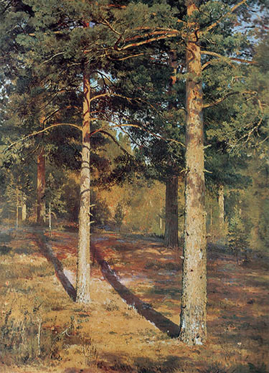
"The Sunlit Pines" 1886
Ivan Ivanovich Shishkin - Artists to Admire

"The Forest of Countess Mordvinova" 1891"
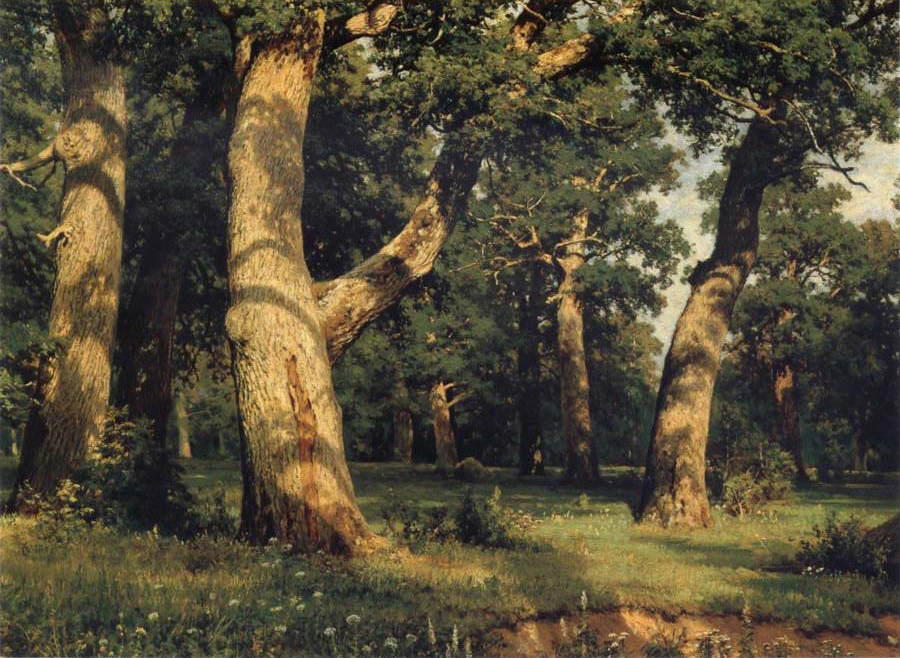
"Oak of the Forest"

"Ships Grove"

"Morning in Pine Forest"
Ivan Ivanovich Shishkin (Russian: January 1832 – 20 March 1898) was a Russian landscape painter closely associated with the Peredvizhniki movement.
________________________________________
I’ve been recently really enjoying the colors during early winter sunsets. This is due especially to the lack of foliage on the deciduous trees. The warmth the sunset puts on all the pine trees is absolutely beautiful. It always makes me think of Shishkin.
I stumbled upon this painter a number of years ago and instantly fell in love. One of the things that is so wonderful about these works are their ability to tell a story and set a mood in a landscape.
I will continue to be amazed by them as I hope you will be too.